In a city like Denver, where innovation meets an active, on-the-go lifestyle, your website has to do more than just look good on a phone. It needs to perform. Mobile-friendly web design: why it matters for Denver businesses isn’t just a talking point anymore. It’s a critical strategy for staying visible, relevant, and competitive in today’s mobile-first world.
While many companies still settle for basic responsiveness, The Ocean Wide knows Denver businesses need more. We create mobile strategies that feel natural to local users, built for the way Coloradans actually browse, search, and buy. Denver’s booming tech scene and outdoor culture create unique digital challenges that generic website design approaches simply can’t address. While competitors focus on basic mobile responsiveness, The Ocean Wide understands that Denver businesses need sophisticated mobile strategies that reflect Colorado’s dynamic lifestyle and competitive market.
This comprehensive guide reveals:
- Advanced mobile optimization techniques beyond basic responsiveness
- Denver-specific design psychology that converts local customers
- Progressive web app integration for Colorado businesses
- Voice search optimization for “near me” queries
- AI-powered personalization strategies
- Local competitor analysis and market positioning
Whether you’re scaling a Boulder startup or expanding a Fort Collins enterprise, this guide provides actionable strategies that go far beyond standard mobile design advice.
Why mobile optimization defines success for Denver businesses
Colorado lifestyle impact on mobile behavior
Denverites are always on the move, and their phones move with them. Whether it’s a cyclist checking weather updates in Wash Park or a tourist looking up food trucks at Civic Center Eats, mobile behavior is embedded in the local lifestyle.
- Browsing happens in bursts while commuting, walking, or waiting.
- Mobile searches spike around local events and seasonal activities.
- Quick access to menus, booking forms, and directions is expected.
When you understand how people use mobile devices in real-life Colorado scenarios, your design becomes smarter, more helpful, and more likely to convert.
Denver’s tech-savvy demographics deep dive
Our city is packed with digital-first users who won’t tolerate clunky websites. If your navigation isn’t thumb-friendly or your content doesn’t load fast, you’re losing potential customers fast.
- Millennials and Gen Z expect seamless mobile experiences.
- Business professionals browse between meetings or on transit.
- Cross-device behavior is common: research on mobile, purchase on desktop.
Mobile-first design isn’t about shrinking desktop content. It’s about understanding what users really want in that moment.
Micro-moment optimization for Denver market
There are four critical mobile moments your website must capture:
- “I-want-to-go” – Users search for nearby businesses and expect instant directions.
- “I-want-to-buy” – High-intent browsing turns into sales if your checkout is mobile-friendly.
- “I-want-to-know” – Quick answers to product or service questions build trust.
- “I-want-to-do” – Tutorials or guides viewed on-the-go create engagement.
Designing for these moments means you have to have these 3 things:
- Streamlined navigation
- Clear CTAs
- Fast load times
Google’s mobile-first indexing reality
Google’s mobile-first indexing has fundamentally changed how websites get discovered. Since July 5, 2024, Google stopped indexing non-mobile-friendly websites entirely. This means your Denver business becomes invisible in search results without proper mobile optimization.
The algorithm prioritizes mobile versions of websites for ranking decisions. If your mobile site performs poorly, your entire online presence suffers. Denver businesses without mobile optimization lose competitive advantages in local search results.
Conversion rate impact on Colorado small businesses
The numbers tell a compelling story. Mobile-friendly design increases conversion rates by 40% compared to non-optimized sites. For Denver businesses, this translates directly to revenue growth and market expansion.
Colorado small businesses see immediate improvements after mobile optimization. Customer engagement increases, bounce rates decrease, and sales conversions improve across all digital touchpoints. The investment in mobile-friendly design pays for itself through enhanced business performance.
Key advantages of mobile-first websites for Colorado markets
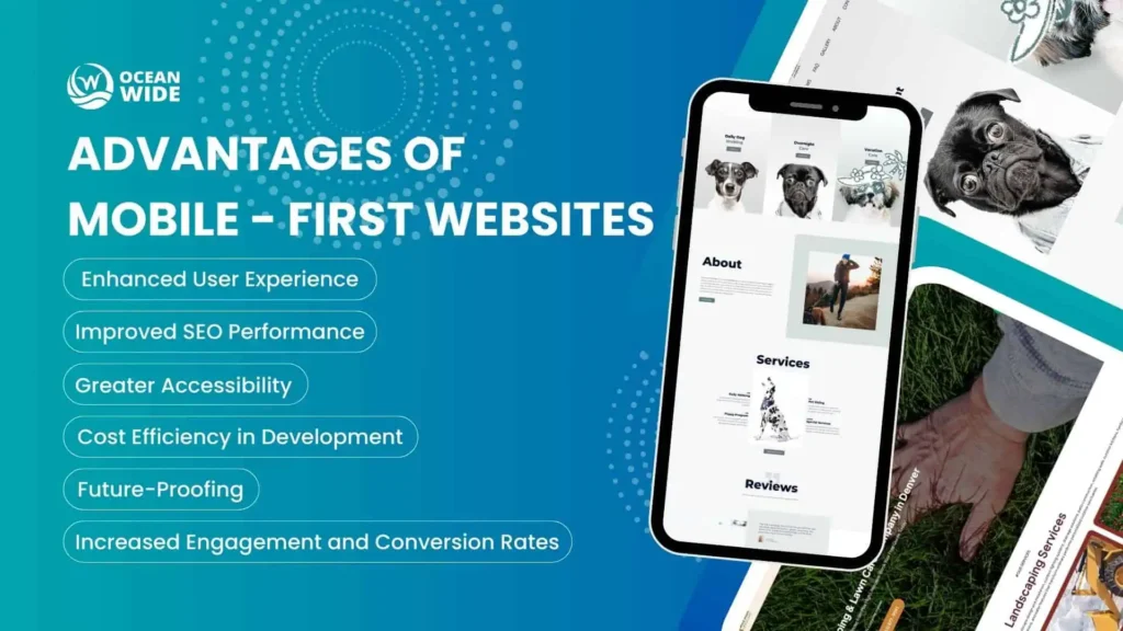
Enhanced user experience
Mobile-first sites deliver intuitive touch interactions designed specifically for finger navigation. Colorado users expect this level of sophistication from local businesses.
Key improvements include:
- Intuitive touch navigation with properly sized buttons
- Streamlined content flow prioritizing essential information
- Faster task completion without user frustration
- Reduced cognitive load through simple, clear layouts
Denver businesses see improved customer retention when mobile experiences meet user expectations.
Improved SEO performance
Google’s ranking algorithms favor sites that align with mobile-first indexing. Your Denver business gains competitive advantages through better Core Web Vitals scores.
SEO benefits include:
- Higher local search rankings over competitors
- Better Core Web Vitals scores for loading and interactivity
- Enhanced local pack visibility in map results
- Stronger user experience signals boosting performance
Mobile-first sites load faster, providing better search engine signals that reinforce rankings.
Increased engagement and conversion rates
User engagement metrics improve dramatically with mobile-first design. Local businesses in Denver see measurable improvements in customer acquisition costs.
Conversion features include:
- Streamlined checkout processes with fewer steps
- Clear call-to-action placement for maximum visibility
- Simplified form completion with mobile-friendly fields
- Reduced abandonment rates through smooth user flows
Mobile-optimized paths result in higher conversion rates and increased revenue per visitor.
Greater accessibility
Mobile-first design principles create inclusive experiences for diverse Colorado populations.
Accessibility improvements include:
- Larger touch targets for users with dexterity challenges
- High contrast text for better readability
- Voice navigation support for hands-free browsing
- Screen reader optimization with proper heading structure
Inclusive design serves multi-generational audiences across the Denver market.
Cost efficiency in development
Single codebase maintenance reduces long-term development costs. Mobile-first approaches streamline project timelines with clear priorities.
Development gains include:
- Reduced maintenance overhead with one codebase
- Faster deployment cycles and streamlined processes
- Lower ongoing costs for updates and features
- Better resource utilization focused on priority features
ROI optimization becomes more predictable, helping Denver small businesses see faster returns.
Future-proofing your Denver business
Mobile-first sites adapt more easily to emerging technologies and platform changes.
Future-proofing advantages include:
- Algorithm update protection for sustained rankings
- Emerging technology readiness for AR and voice search
- Scalable architecture for easy feature integration
- Competitive longevity with sustainable advantages
Long-term market positioning becomes stronger with proper mobile optimization.
Choosing professional mobile optimization for your Denver business
DIY solutions often create more problems than they solve. While WordPress themes claiming mobile responsiveness frequently fail performance tests. But custom development without mobile expertise results in sites that look acceptable but perform poorly.
Professional agencies understand Colorado market nuances. They recognize local user behavior patterns, competitive landscapes, and regional preferences. Same-timezone support provides immediate assistance when issues arise.
The Ocean Wide specializes in mobile-first design for Denver businesses. Our team combines technical expertise with local market knowledge to deliver results that drive growth. We understand the unique challenges facing Colorado startups and small businesses.
“Platform selection impacts long-term success.”
WordPress works well for content-focused sites with proper optimization. Custom development offers unlimited flexibility for businesses with specific requirements. Professional guidance ensures you choose the right foundation for your goals.
Understanding responsive design versus mobile-first approaches
Choosing the right approach for your Denver business depends on your current situation, budget, and long-term goals. Both methods have distinct advantages and limitations that affect performance, cost, and user experience.
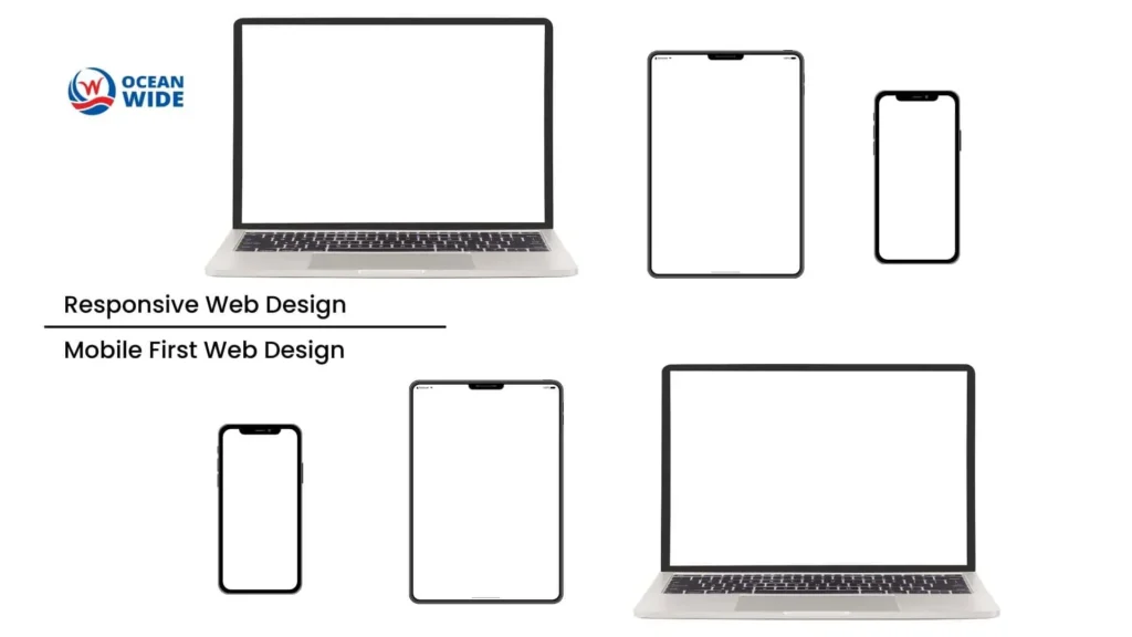
Responsive design vs. mobile-first: key differences
Responsive Design Approach:
- Starts with desktop design, then adapts for mobile
- Uses flexible grids, scalable images, and CSS media queries
- Works backward from large screens to small screens
- Familiar development process for traditional web teams
- Cost-effective for existing sites with established desktop presence
- Often results in compromised mobile performance
- Mobile considerations come as an afterthought
Mobile-First Design Approach:
- Begins with mobile experience, then scales up for larger screens
- Prioritizes the majority of users from project start
- Built specifically for mobile constraints and touch navigation
- Creates superior performance through mobile-optimized foundation
- Delivers more intuitive user interactions on all devices
- Requires initial investment but provides better long-term ROI
- Future-proof architecture adapts easily to new technologies
Performance comparison
Responsive Design Performance:
- Slower loading times due to desktop-first architecture
- Larger file sizes affecting mobile network performance
- Compromise-based solutions that satisfy neither desktop nor mobile fully
- Requires additional optimization work for mobile speed
Mobile-First Performance:
- Faster loading times with mobile-optimized foundation
- Smaller initial file sizes improving network performance
- Purpose-built for mobile constraints and capabilities
- Superior Core Web Vitals scores boosting search rankings
Denver business recommendations
Choose Responsive Design If:
- You have an existing site generating acceptable results
- Budget constraints require immediate cost savings
- Your audience primarily uses desktop devices
- You need a quick improvement rather than complete overhaul
Choose Mobile-First Design If:
- You’re launching a new business or planning complete redesign
- E-commerce conversion optimization is a priority
- Long-term growth and scalability matter most
- You want to maximize search engine performance
Industry-Specific Recommendations:
- Startups and new businesses: Mobile-first delivers best long-term results
- E-commerce sites: Mobile-first essential for conversion optimization
- Service-based businesses: Responsive may suffice with proper optimization
- Established companies: Evaluate current performance versus redesign ROI
The Ocean Wide helps Denver businesses choose the right approach based on specific needs, current performance, and growth objectives. Our team provides expert analysis to determine whether responsive optimization or mobile-first development delivers the best value for your investment.
Common mobile design mistakes killing Denver businesses
Many Colorado businesses unknowingly sabotage their mobile success through preventable design errors. These mistakes cost revenue, reduce search visibility, and drive potential customers to competitors. Understanding these pitfalls helps you avoid costly oversights that damage your digital presence.
Technical performance issues
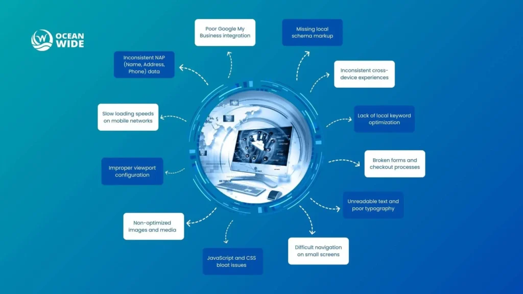
- Slow loading speeds destroy mobile conversions immediately. When pages take longer than three seconds to load, you lose 53% of mobile visitors before they see your content. Colorado’s varied connectivity challenges make speed optimization even more critical for business success.
Critical performance mistakes include:
- Uncompressed images – Large image files that slow loading across mobile networks
- Excessive HTTP requests – Too many external resources causing delays
- Unoptimized server response times – Slow hosting affecting user experience
- Missing browser caching – Repeat visitors experience slow load times
- Poor viewport configuration creates frustrating user experiences. Text becomes unreadable, images don’t scale properly, and navigation becomes impossible on smaller screens. Non-optimized images and media files slow down loading times significantly across the Denver metro area.
- JavaScript and CSS bloat issues compound performance problems. Excessive code creates technical debt that affects your business visibility in search results. Clean, optimized code ensures faster loading and better user experiences.
User experience failures
- Difficult navigation on small screens drives customers away before they can engage with your business. Touch-friendly design requires minimum 44px tap targets for optimal usability. Buttons that are too small or close together frustrate mobile users.
Common navigation mistakes that kill conversions:
- Tiny touch targets – Buttons smaller than 44px cause accidental taps
- Overcrowded menus – Too many options creating decision paralysis
- Hidden navigation elements – Important links buried in complex menus
- Non-responsive dropdown menus – Menus that don’t work on touch screens
- Unreadable text and poor typography violate accessibility standards for Colorado users. Font sizes below 16px become difficult to read on mobile devices. Proper contrast ratios ensure your content remains accessible to diverse populations.
- Broken forms and checkout processes cost businesses immediate sales. E-commerce sites lose customers at the final conversion step because buttons are too small, fields don’t work properly, or the process feels cumbersome on touch screens.
Local SEO catastrophes
- Missing local schema markup means Google can’t properly categorize your Denver business. Structured data helps search engines understand your services, location, and business hours. Without proper markup, you lose visibility in local search results.
Local SEO mistakes that damage rankings:
- Inconsistent business listings – Different information across directories
- Missing Google My Business optimization – Incomplete or outdated profiles
- No local keyword targeting – Missing opportunities for Front Range searches
- Broken citation building – Inconsistent NAP data across platforms
- Poor Google My Business integration reduces your local pack ranking potential. Inconsistent business information across platforms confuses search algorithms. Your mobile site must align perfectly with your Google My Business profile.
- Inconsistent NAP data (Name, Address, Phone) across platforms damages your local search authority. Lack of local keyword optimization means missing Front Range search traffic opportunities. These mistakes compound to significantly reduce your online visibility.
- The cost of these mistakes compounds over time. Each error reduces your competitive advantage while better-optimized competitors capture more customers. The Ocean Wide helps Denver businesses identify and fix these critical issues through comprehensive mobile audits and strategic optimization.
Tools and technologies Denver agencies actually use
Your site is only as strong as the tools behind it. Here’s what modern Denver web design agencies (including us) rely on.
Professional development stack
- Google Lighthouse for performance scoring
- GTmetrix and WebPageTest for speed checks
- BrowserStack for cross-device testing
Design and prototyping tools
- Figma for designing mobile-first wireframes
- Adobe XD and InVision for collaboration
- Zeplin for dev handoff and responsive spacing
The Ocean Wide’s proprietary tech advantage
We don’t stop at standard tools. Our Denver team uses:
- Custom optimization scripts to meet Google Mobile-First Indexing benchmarks
- Predictive content tools for better user engagement
- Built-in modules for schema, Core Web Vitals, and ADA compliance
Mobile design integration with digital marketing strategy
Great design doesn’t work in a silo. It should connect with your broader marketing strategy.
Mobile-social media synergy
- Ensure Instagram and TikTok links land on fast, mobile-optimized pages
- Showcase user-generated content right in your mobile layout
- Use clickable review snippets to build trust
Email marketing mobile optimization
- Keep subject lines short and scannable
- Use buttons, not links, for CTAs
- Design one-column mobile-friendly email templates
Paid advertising mobile landing pages
- Design landing pages for mobile first, not as an afterthought
- Test CTA placement and form length with mobile A/B testing
- Use location-based copy for better click-through in Denver neighborhoods
FAQ about Mobile-friendly web design: why it matters for Denver businesses
What makes a website mobile-friendly for Denver businesses?
Mobile-friendly websites display properly on all screen sizes, load quickly on mobile networks, and provide intuitive touch navigation. Key elements include responsive design, optimized images, readable text, and touch-friendly buttons. The Ocean Wide ensures all these elements work perfectly for Denver market needs.
How long does mobile optimization take for a Denver small business?
Professional mobile optimization typically takes 3-6 weeks depending on site complexity and features. The Ocean Wide’s streamlined process delivers mobile-optimized sites designed for Colorado markets within this timeframe, including local SEO integration and performance optimization.
Should Denver businesses choose responsive or mobile-first design?
For new businesses or complete redesigns, mobile-first design offers superior performance and better SEO results. Established Denver businesses with functional sites may benefit from responsive optimization first. The Ocean Wide provides expert guidance to help you choose the best approach for your specific situation.
How does mobile optimization improve local search rankings in Denver?
Mobile-optimized sites achieve better Core Web Vitals scores, align with Google’s mobile-first indexing, and provide superior user experience signals. Denver businesses typically see 25% improvement in local search visibility after professional mobile optimization.
What does mobile web design cost for Denver small businesses?
Mobile design costs vary based on site complexity, features, and business requirements. The Ocean Wide provides customized quotes after understanding your specific needs. Contact us at (720) 334-0899 for a free consultation and detailed pricing information tailored to your Denver business goals.
Conclusion
Your Denver business deserves mobile optimization that converts visitors into customers. The Ocean Wide delivers mobile-first web design built specifically for Colorado business growth. Our mobile-friendly web design Denver-based team provides the local expertise and technical skills your business needs to thrive.
Don’t let poor mobile experiences cost you customers. Mobile-friendly web design has become essential for business survival in today’s digital marketplace. Every day you delay optimization, competitors gain advantages that become harder to overcome.
Contact The Ocean Wide today for your free mobile audit. We’ll identify optimization opportunities and create a strategy for capturing more local customers. Your success in Denver’s competitive market starts with mobile excellence.
Call (720) 334-0899 or schedule your consultation online. Let’s build the mobile experience your Denver business deserves.
